Viewing entries in
how to

2 Comments

Creating a Post-it Note Themed Brainstorming Space in Tinderbox

Sometimes when I’m using Tinderbox, I want the experience and aesthetics of working with Post-it notes on a large blank wall. This morning, as I was brainstorming some end-of-the-year OKRs, I figured out how to create such a space without the extra clicking that Prototypes or Stamps require. The above video takes you through the steps I took to assign OnAdd rules to a container where all notes created (or pasted) into it look Post-it-note-ish.

To make these notes, I typed ⌘1 for “Inspector”, clicked the “Gear” icon on far right, selected the “Action” tab, pasted the following code, and hit ↵: $Color = "cooler poppy"; $Width = 6; $Height = 6; $Shadow = true; $ShadowDistance = 10; $ShadowBl…

To make these notes, I typed ⌘1 for “Inspector”, clicked the “Gear” icon on far right, selected the “Action” tab, pasted the following code, and hit ↵: $Color = "cooler poppy"; $Width = 6; $Height = 6; $Shadow = true; $ShadowDistance = 10; $ShadowBlur = 20; $ShadowColor = "lightest black"; $NameAlignment = "center"; $NameFont = "SketchnoteSquare";

2 Comments

2 Comments

Prettier Tinderbox Maps

I’ve created a couple videos recently that demonstrate some techniques I use to make my Tinderbox maps a bit more aesthetically pleasing. It’s important to note that 1) as a designer; and 2) as someone who is encouraged to make more maps when my maps look nice, I value these tricks, perhaps, a bit too much. This is because some of them compromise the integrity of the data between linkages. This is shameful! (I know!) But alas I remain a bit shameless about it because I’m making maps that make me happy and the maps help me learn, so two wins, one loss… I’ll take it. Here they are:

Some example maps (click to expand)

2 Comments

1 Comment

Turning Reading Notes into a Tinderbox Map

concept-map.png

A reader emailed me this morning and wrote:

I've been in two minds about getting Tinderbox for some time due to the steep perceived learning curve. Your videos helped a lot.

What you didn't show was your process for getting information/ideas into TBX, and then creating the relevant reference links to other notes, etc. Would love to see another series on that :) {hint hint}"

And so, in the same rambling and rough-cut way I created my original Zettelkasten & Tinderbox videos, I created this four-part series. Part three is the worst — my apologies — but also, blame André. ☝️

A few notes before we begin:

  • Y’all. This is very boring.

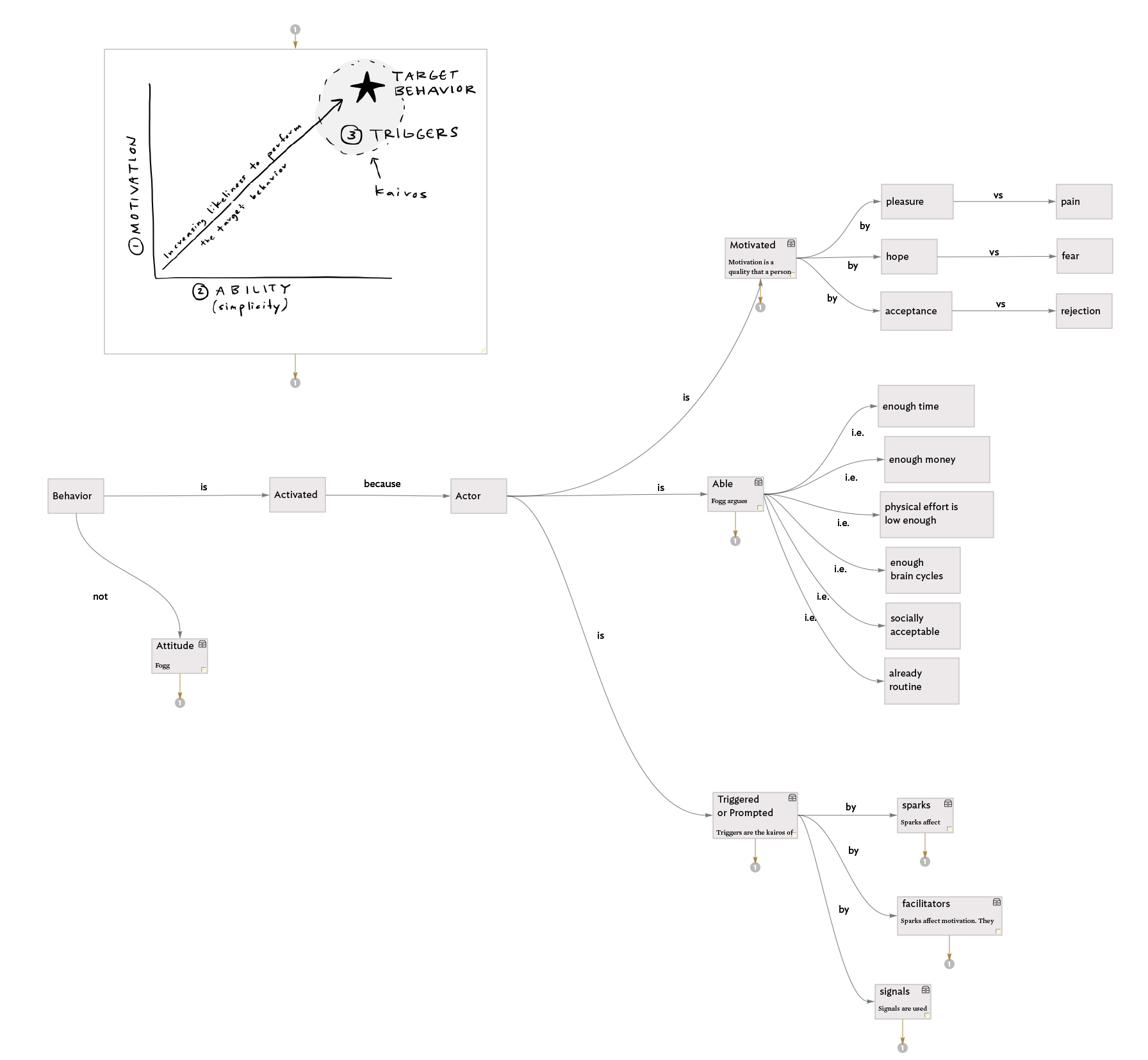
  • I don’t think it matters so much how I map the information, but rather that I map it. For example, a few days ago, I was recalling the three types of triggers in BJ Fogg’s model for persuasive technology design and I did so by mentally traversing the map. The spatial layout created in Tinderbox helped me remember that those three triggers are: “sparks,” “facilitators,” and “signals.” See? I just did it again!

  • I think it is exceptionally important to just start mapping, you can always edit later.

  • This is so 100% me and my own way. I hope sharing it enables you to find you and your own way.

.Nearly an hour to waste awaits. Please, do at least watch it at double speed.

1 Comment